Documentation Index
Fetch the complete documentation index at: https://docs.xquiz.com.br/llms.txt
Use this file to discover all available pages before exploring further.
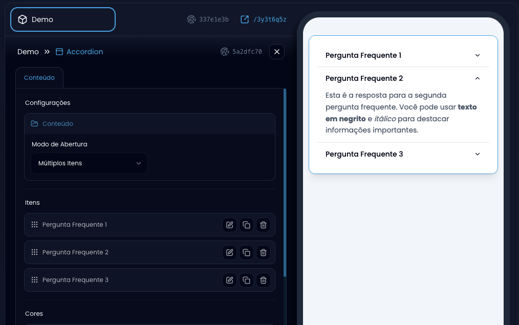
- Organize information in collapsible sections to save space.
- Create interactive FAQs (Frequently Asked Questions).
- Present detailed content in an organized and accessible way.
- Improve user experience with intuitive navigation.
- Reduce visual overload while keeping important information accessible.
- Single: Only one item can be open at a time (default behavior).
- Multiple: Several items can be open simultaneously.
- Title: Main text of each section with rich formatting (bold, italic, colors, etc.).
- Description: Detailed content of each section with full text editor.
- Variables: Insert dynamic variables in both title and description.
- Minimum: 1 required item.
- Maximum: 10 items per accordion.
- Formatting: Full editor with toolbar for advanced formatting.
- Border: Color of separator lines between items.
- Title: Custom color for the title text of each item.
- Description: Custom color for the description content.
- Icon: Color of the expand/collapse icon.
- Transition: Smooth animation when opening and closing items.
- Icon: Icon rotation indicating the state (open/closed).
- Hover: Underline effect when hovering over the title.
- Click: Expand/collapse content when clicking on the title.