Documentation Index
Fetch the complete documentation index at: https://docs.xquiz.com.br/llms.txt
Use this file to discover all available pages before exploring further.
 Want to better understand your visitor and at the same time make your page much more interactive?
The Quiz element is perfect for this! It allows you to create simple questions, with one or multiple answer options and the best part, with visual and fun models, like emojis, images, or custom buttons. Ideal for capturing user attention!
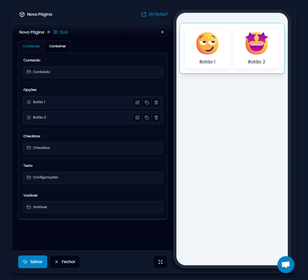
“Content” Tab
This is where you define the format of the options and the buttons that the user will click.
Want to better understand your visitor and at the same time make your page much more interactive?
The Quiz element is perfect for this! It allows you to create simple questions, with one or multiple answer options and the best part, with visual and fun models, like emojis, images, or custom buttons. Ideal for capturing user attention!
“Content” Tab
This is where you define the format of the options and the buttons that the user will click.
-
Format: Choose if the buttons appear in Column or List.
-
Template: Can be Text, Image, Icon, or Emoji.
-
Position: Defines where the visual content of the button appears (left, right, top, or bottom).
-
Alignment: Centers or aligns buttons to the left or right.
-
Multiple response: If activated, the user can select more than one option.
Options (Buttons)
Each quiz option is an editable button:
-
You can change the text, emoji, icon, or image of each button.
-
You can duplicate, reorder, or delete buttons as you wish.
Checkbox (optional)
Choose this option to display a circular selection marker on the left or right of the quiz.
You can customize:
-
Position
-
Size
-
Border
-
Spacing
-
Rounding
-
Border color
-
Background color
Text
Controls the text inside the button. You can display or hide the text in the button.
Other settings:
-
Font size
-
Line height
-
Spacing
-
Padding
-
Text and background color
-
Rounded border
Variable
Use this field to store the chosen response and use it later in the quiz. For example, you can save the person’s gender, age, or preferences to personalize the final result or direct content.
Think of the variable as a “label” that stores what the user answered.
Just select or create a variable.
“Container” Tab
Allows you to style the entire block where the quiz is located. This is where you customize the external appearance:
-
Borders: style, color, rounding, and sides.
-
Background: solid color, linear or radial gradient.
-
Padding: defines the internal spacing of the container.
-
Animation: defines how this block will appear on the page.
-
Delay: you can define a delay for it to appear.
Usage tip!
Use the Quiz element right at the beginning of your funnel to generate immediate engagement. Start with simple and visual questions (with emojis or images) to encourage clicking.